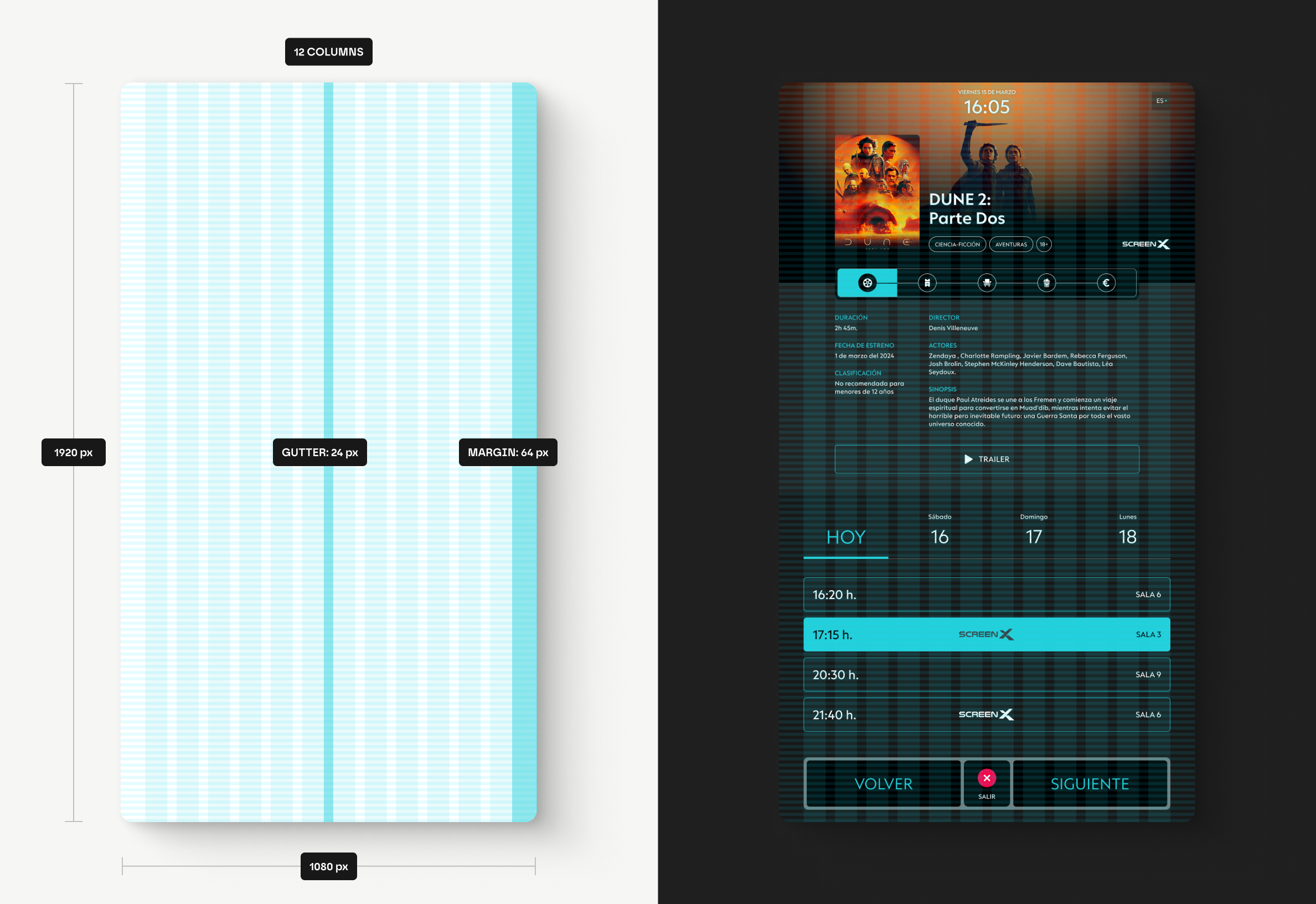
- Screen
- 1080x1920 px
- Year
- 2024
A digital product that allows users to explore available movie listings for cinema ticket purchases. Through a few simple steps, it enables the entire process to be completed quickly, intuitively, and efficiently.
The problem
The main goal of this project has been to identify and extract key points through user-centered research in order to redesign a digital product focused on cinema ticket purchases, aiming to improve the navigation experience and optimize the entire purchase process.
Initially, several critical issues were identified, such as unintuitive navigation, a lack of clear information structure, and buttons and text content that were visually too small. Additionally, essential functionalities like filters for genre, age, or language were missing, as well as the absence of a progress bar, and the inability to add additional products like popcorn or drinks. These deficiencies resulted in a long and confusing purchase process, negatively impacting the user experience.
The solution
Through various research methods, such as surveys, interviews, direct competitor analysis, prototype testing, and real user behavior observation (shadowing), all key insights for improving the cinema ticket purchasing experience in a public setting via a digital kiosk have been identified. This research not only allowed me to understand the users' needs and preferences but also detect the main weaknesses in the navigation and interaction of this digital product.
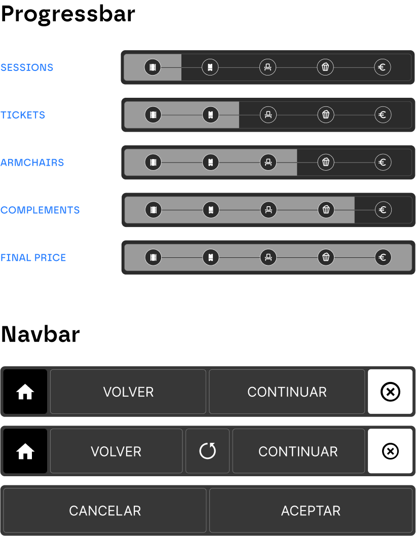
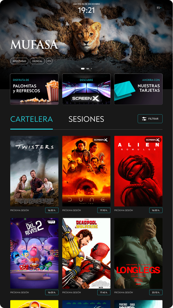
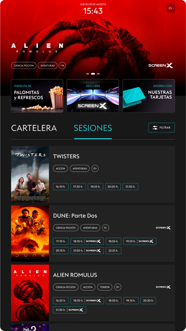
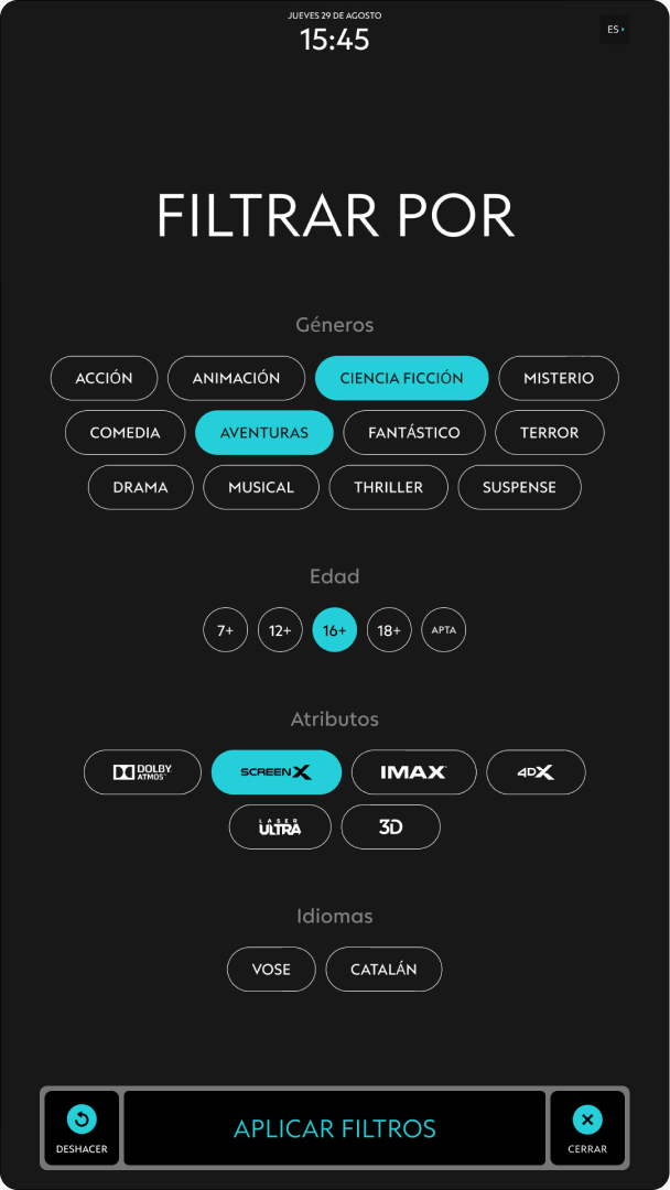
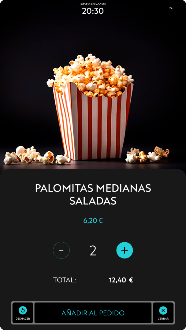
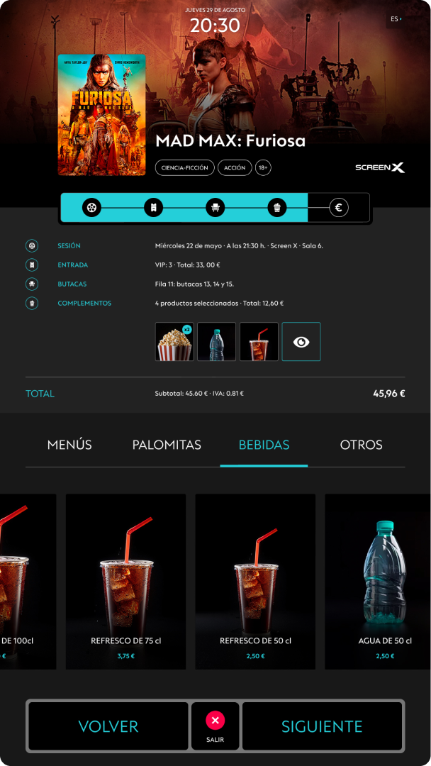
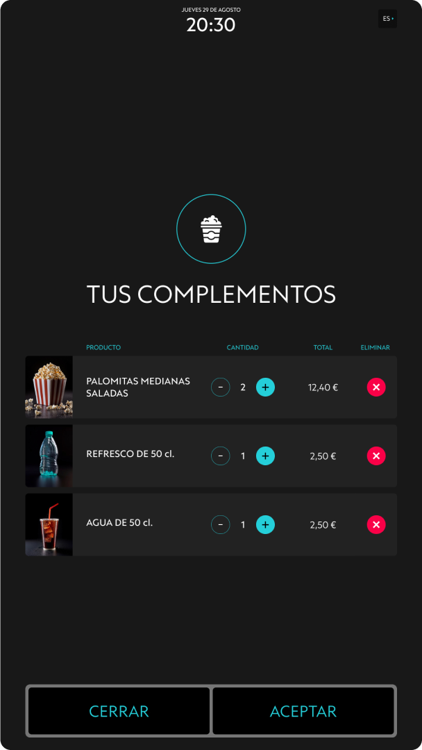
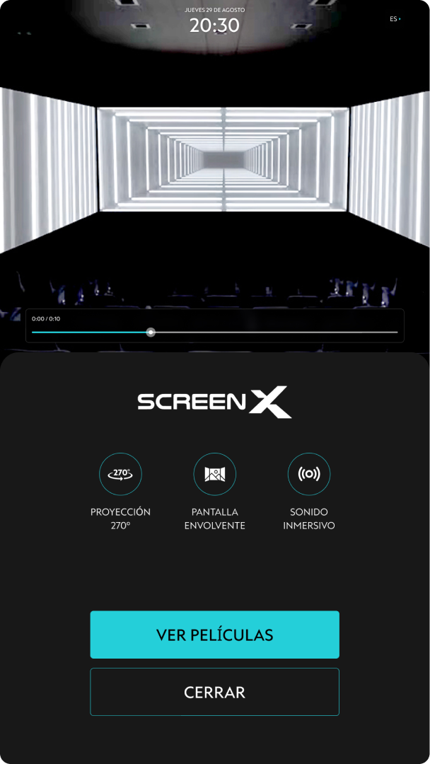
To address the main issues identified, a new structure has been developed to facilitate access to all content along two axes: a progress bar to provide better understanding of the entire purchase process and a main navigation system that gives users control over their actions. Visual elements, such as buttons, icons, and texts, have been adjusted to be larger and more readable. Additionally, users are provided with information about the new 'Screen X' technology. Finally, new functionalities have been incorporated, such as filters to improve the search for movies by genre, language, and age, as well as the option to purchase popcorn and drinks.
RESEARCH
For data collection, surveys and interviews were conducted with previously defined potential profiles, as well as direct observation of user behavior (shadowing) to gain a better understanding of the needs and expectations to be addressed.
ARCHITECTURE
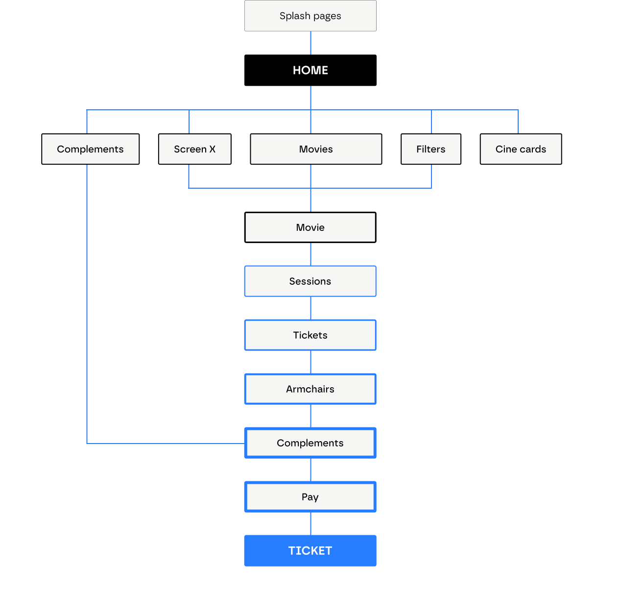
All content is organized into two clear phases: the selection options for the available movies and the execution of the entire purchase process.
WIREFRAMES
Considering the various insights gathered during the research phase, different content structures have been explored through wireframes (both low and mid fidelity) to generate several viable solutions.
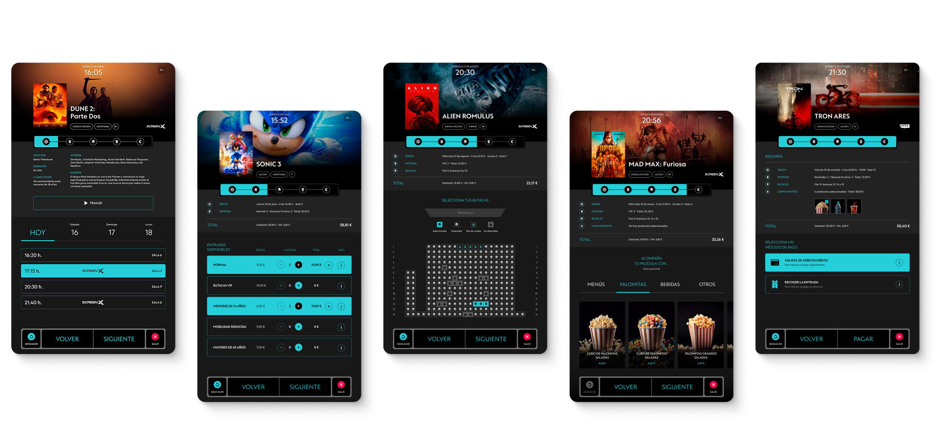
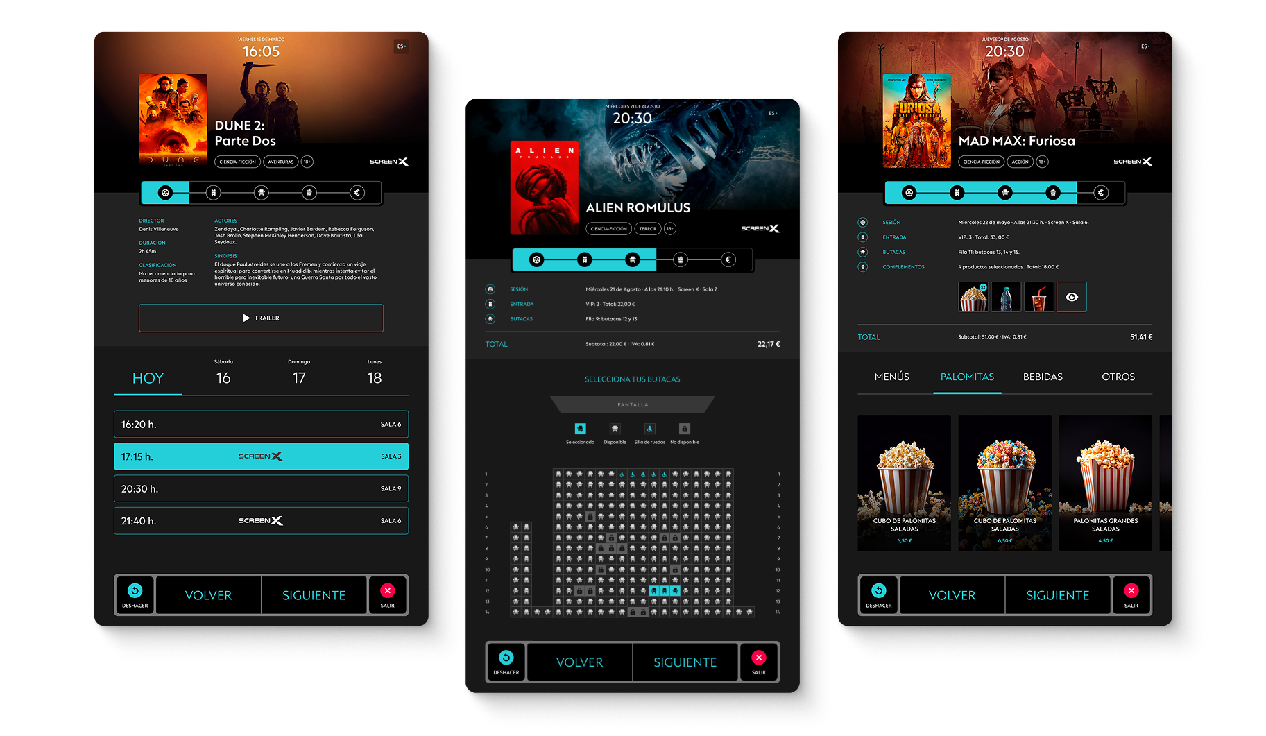
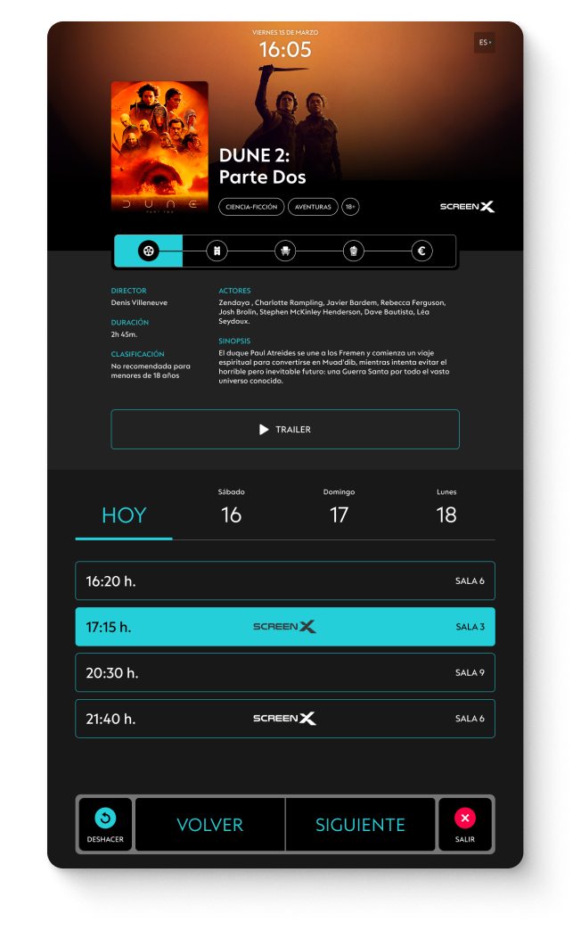
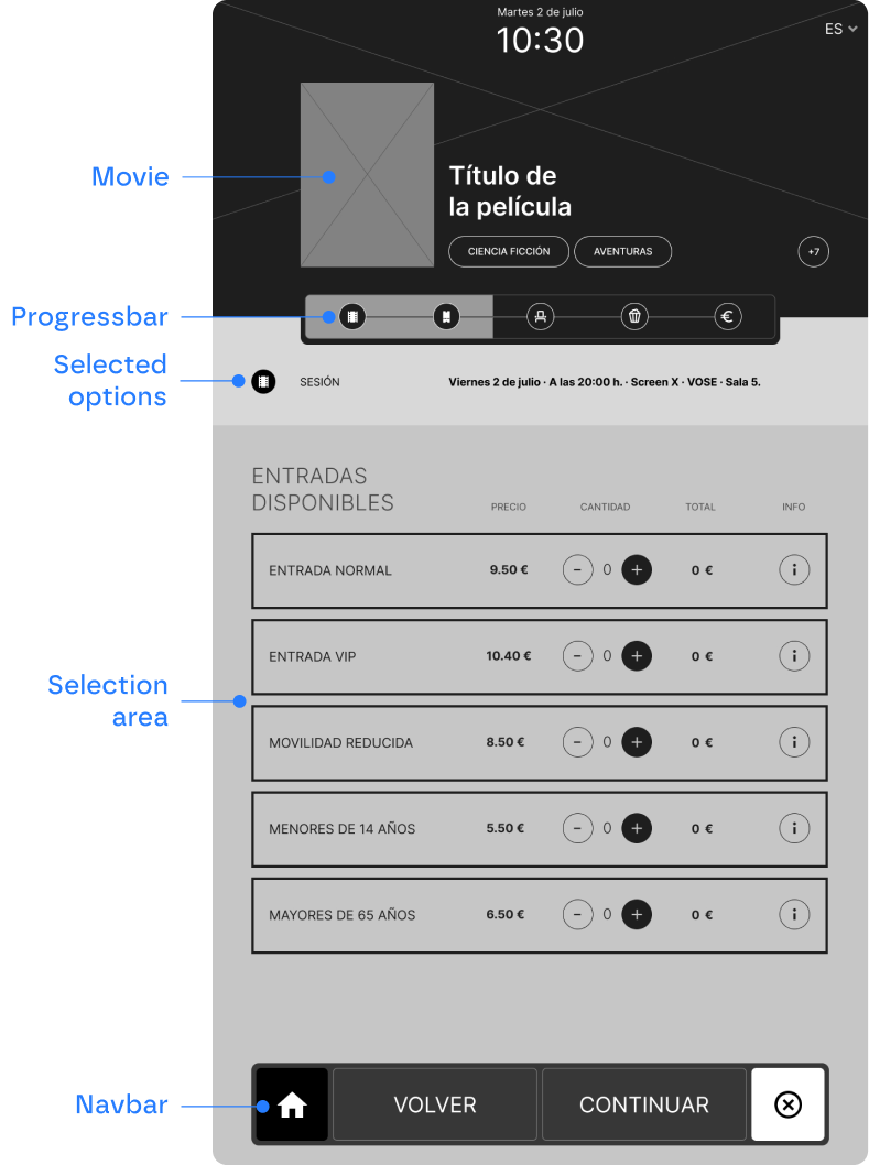
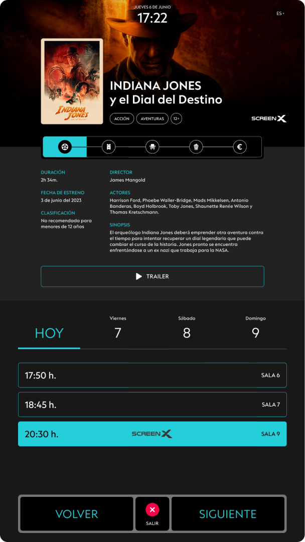
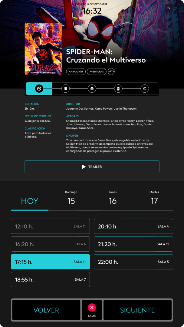
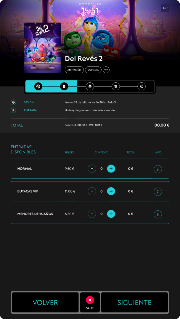
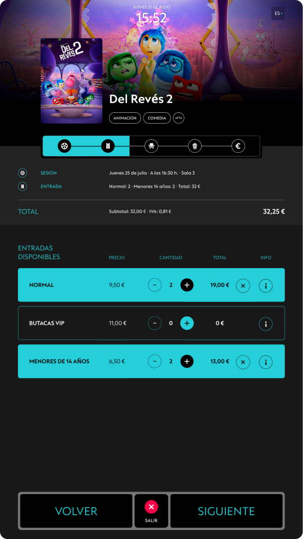
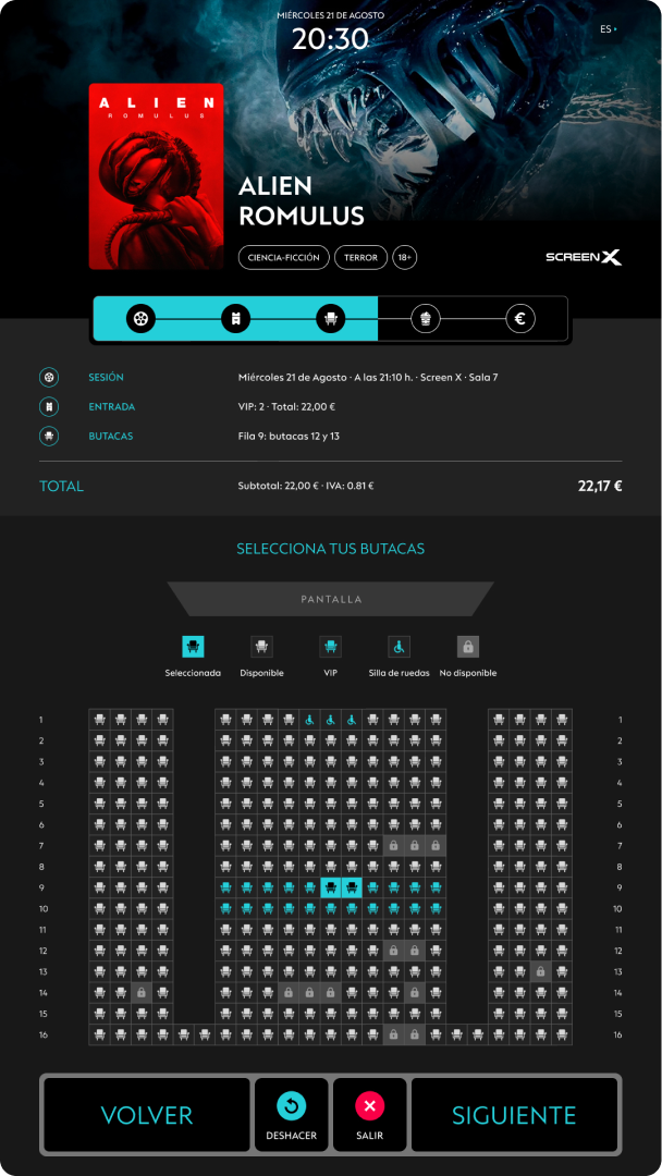
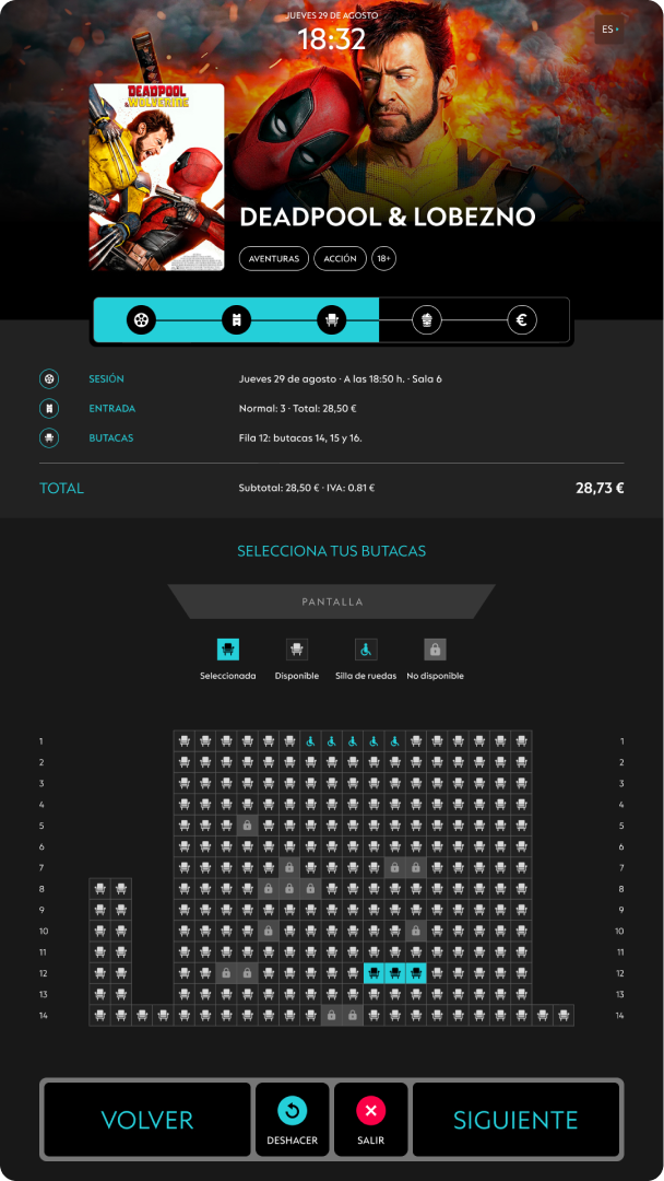
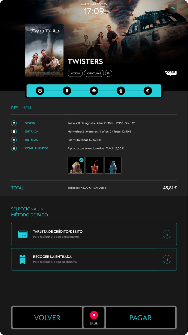
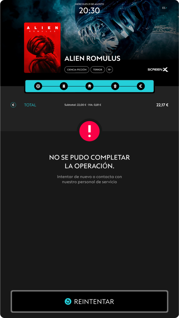
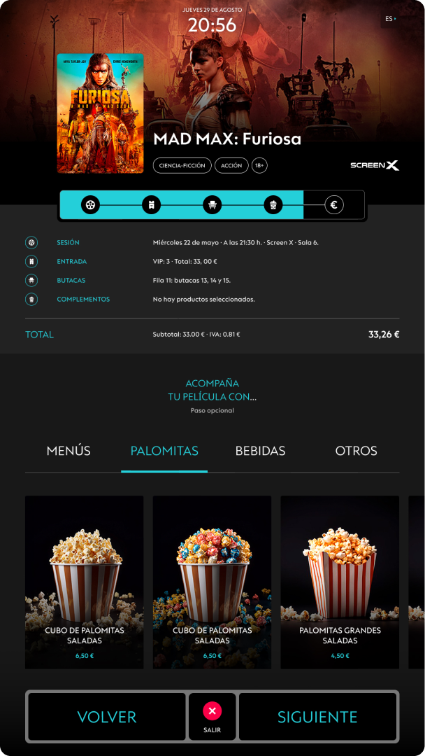
Throughout the entire navigation, the available content is visible from a single structure: a progress bar that guides the user through the purchase process, a space that summarizes the previously selected options, the selection area, and a bottom navigation menu that allows the execution of the proposed actions.
DIGITALPRODUCT
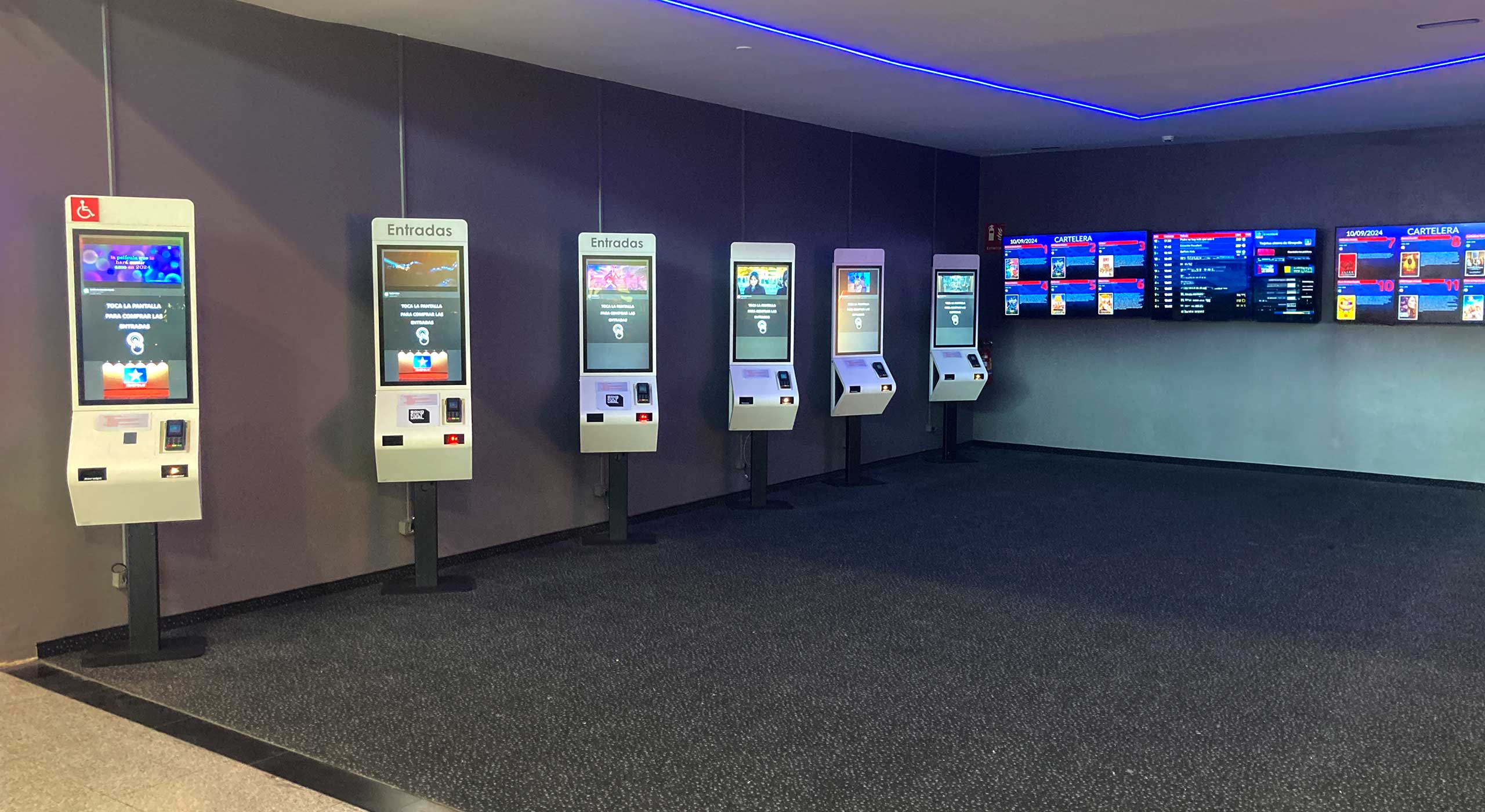
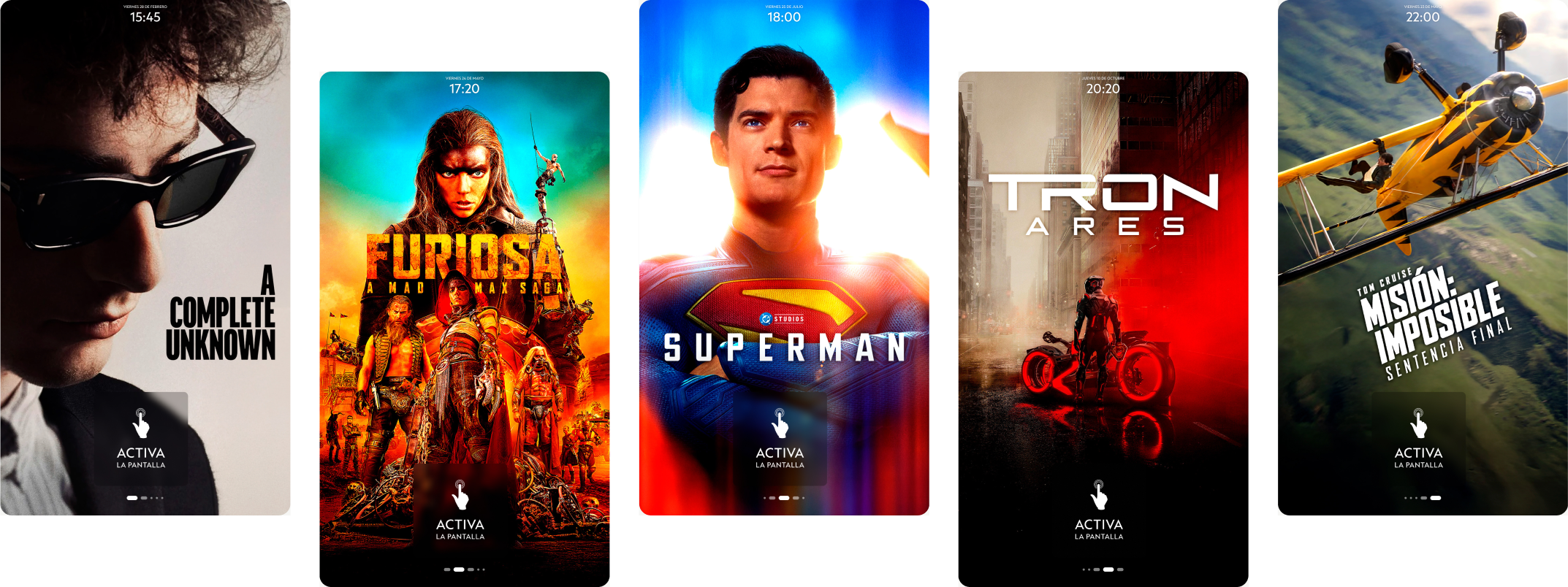
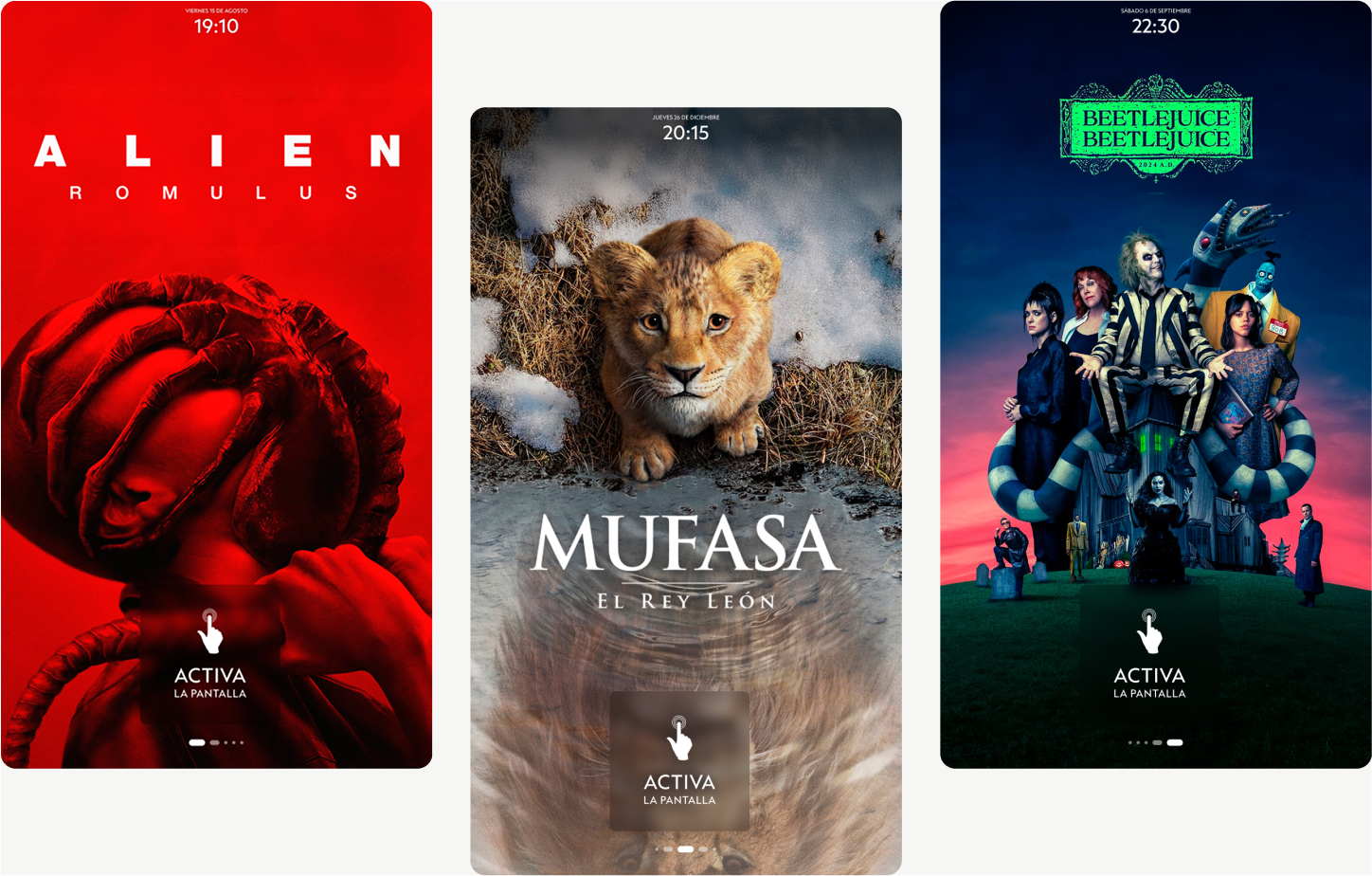
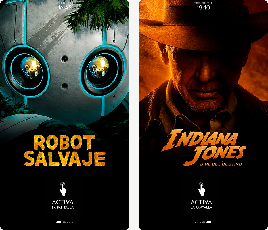
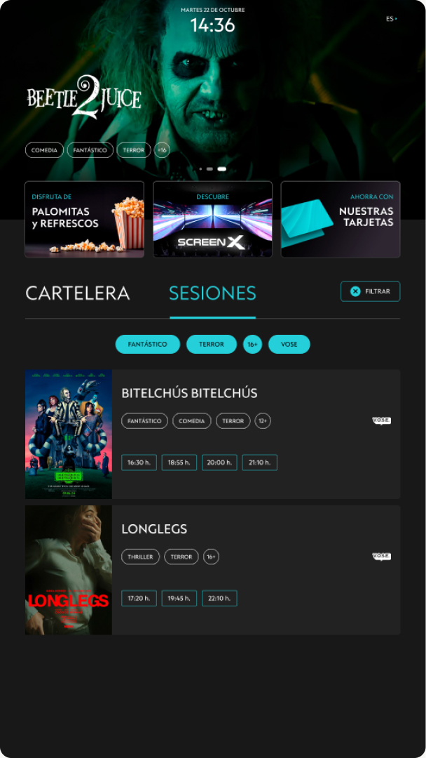
From the very beginning, the list of available movies is presented as a visual attraction to capture the user's attention and invite them to use the kiosk to purchase their cinema tickets.
With the touch activation, the platform provides all the information needed to select a movie from the homepage: showtimes, sessions, filters, promotions, and other details of interest, in a clear and accessible manner.
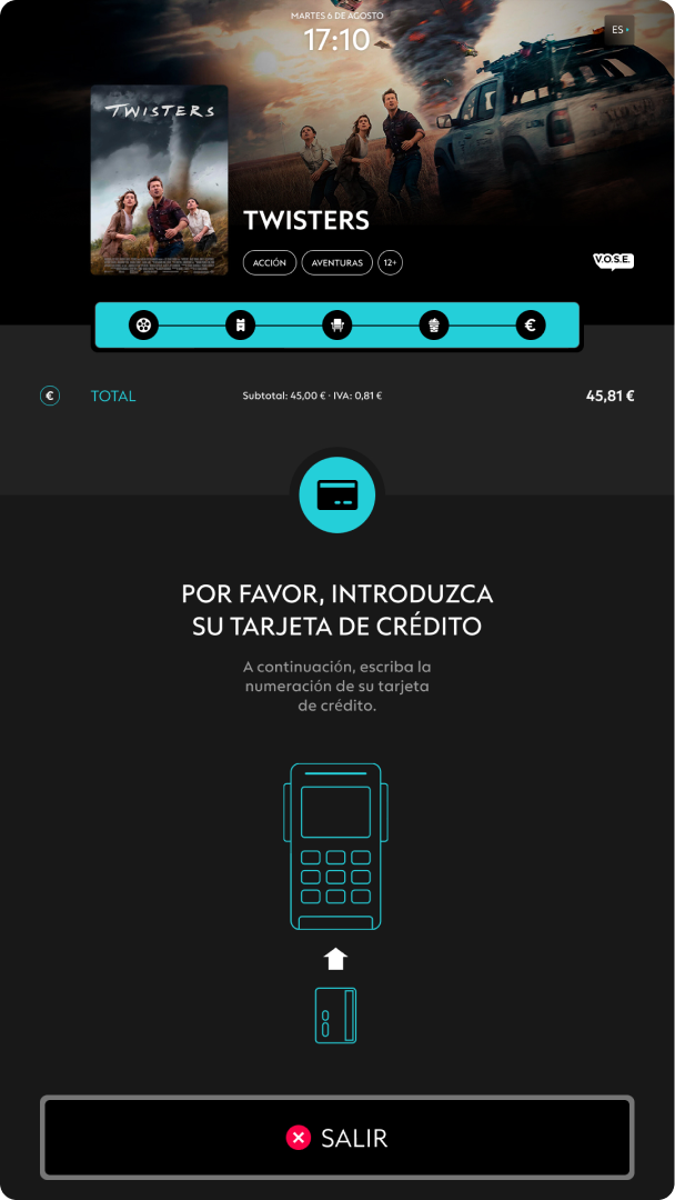
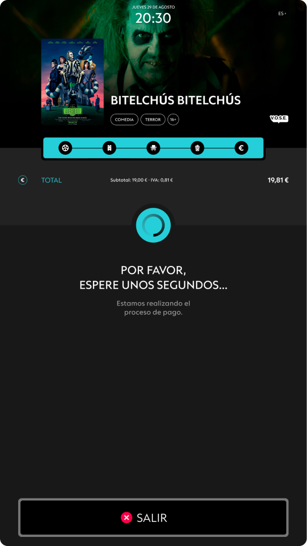
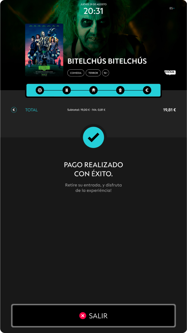
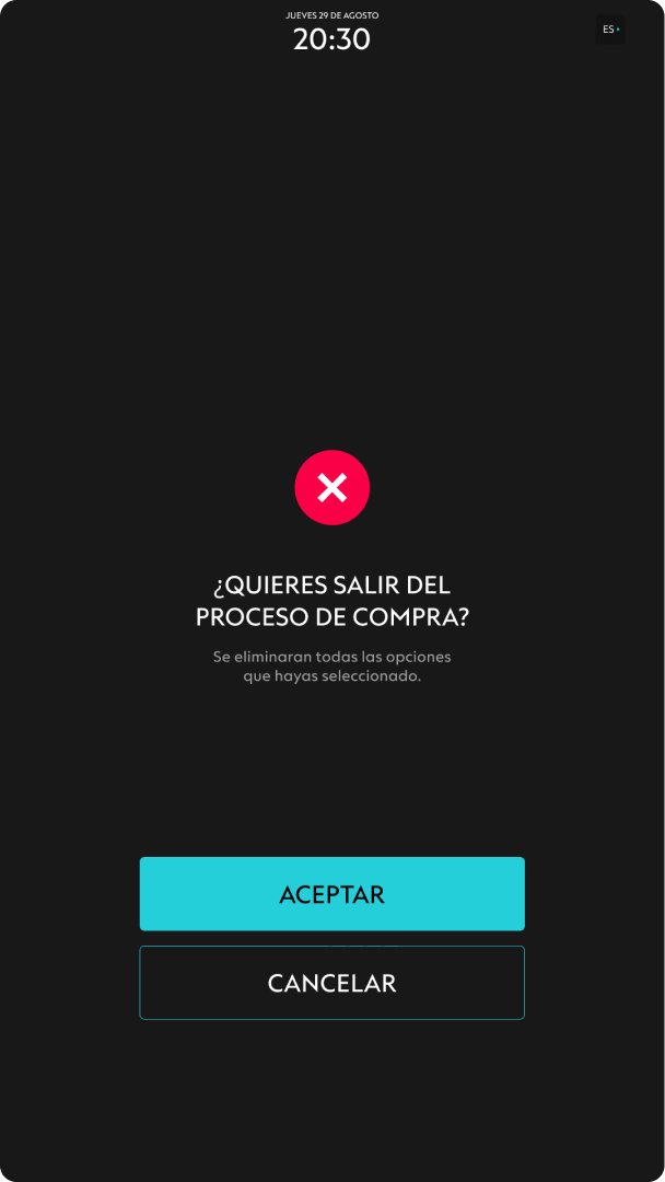
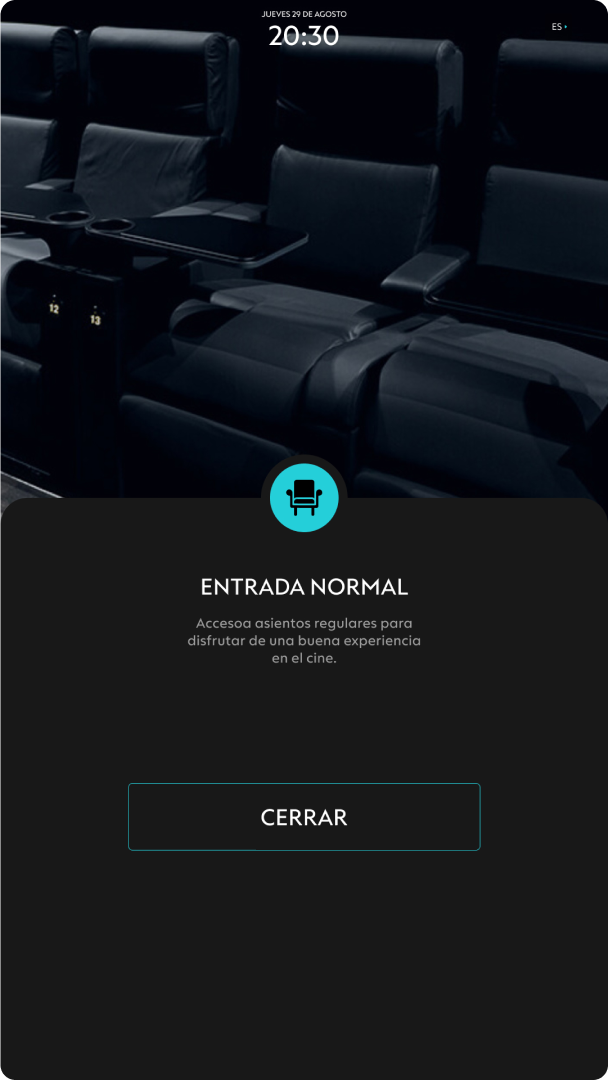
Once the movie is selected, the purchasing process is activated automatically. The kiosk guides the user through each step, offering options to choose the session, ticket type, seats, and payment method, facilitating a quick and intuitive purchase.
Sessions
TICKETS
Armchairs
Complements
Pay
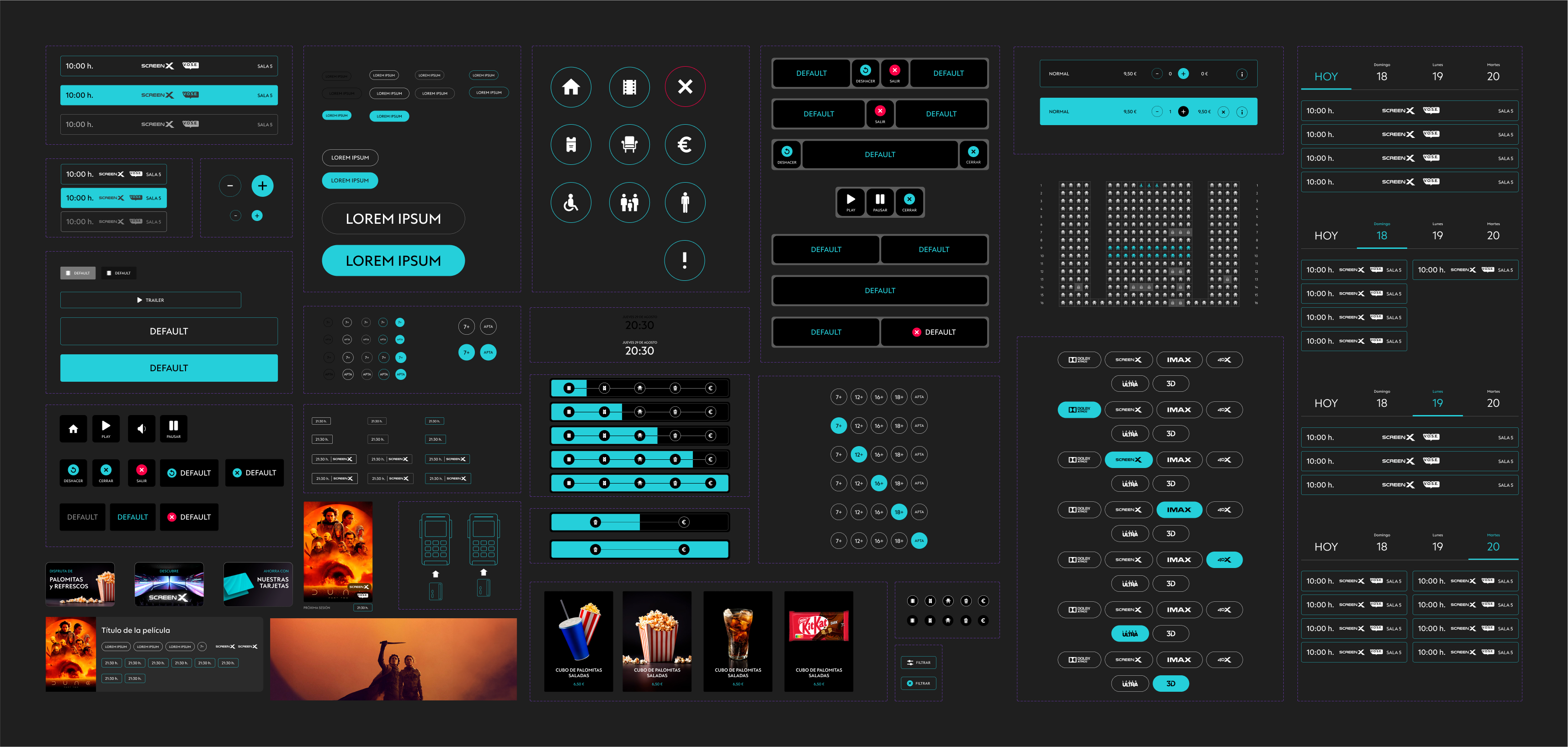
UI KIT
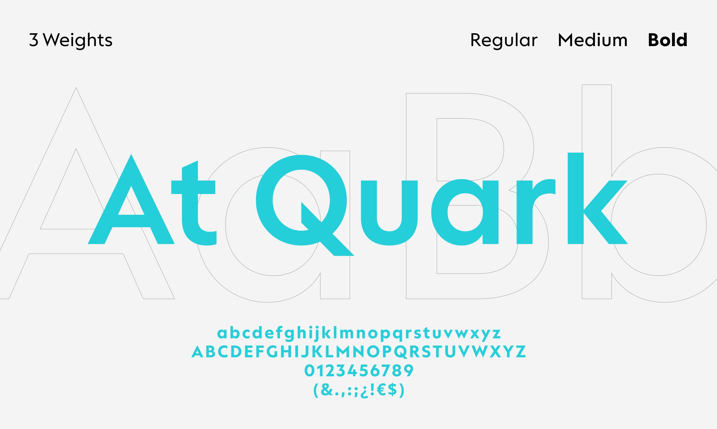
Finally, the visual resources used to maintain aesthetic coherence throughout the digital product are presented, along with the components and page structures created to achieve a complete user experience.